
GLOBAL AMSTEL. CARIBBEAN BRIGHT.
Client: AMSTEL GLOBAL / Brand: Amstel -BRIGHT / Category: Alcoholic & Non-Alcoholic Beverages / Market: The Caribean / Fields: Branding, key visual identity, Packaging , Socials
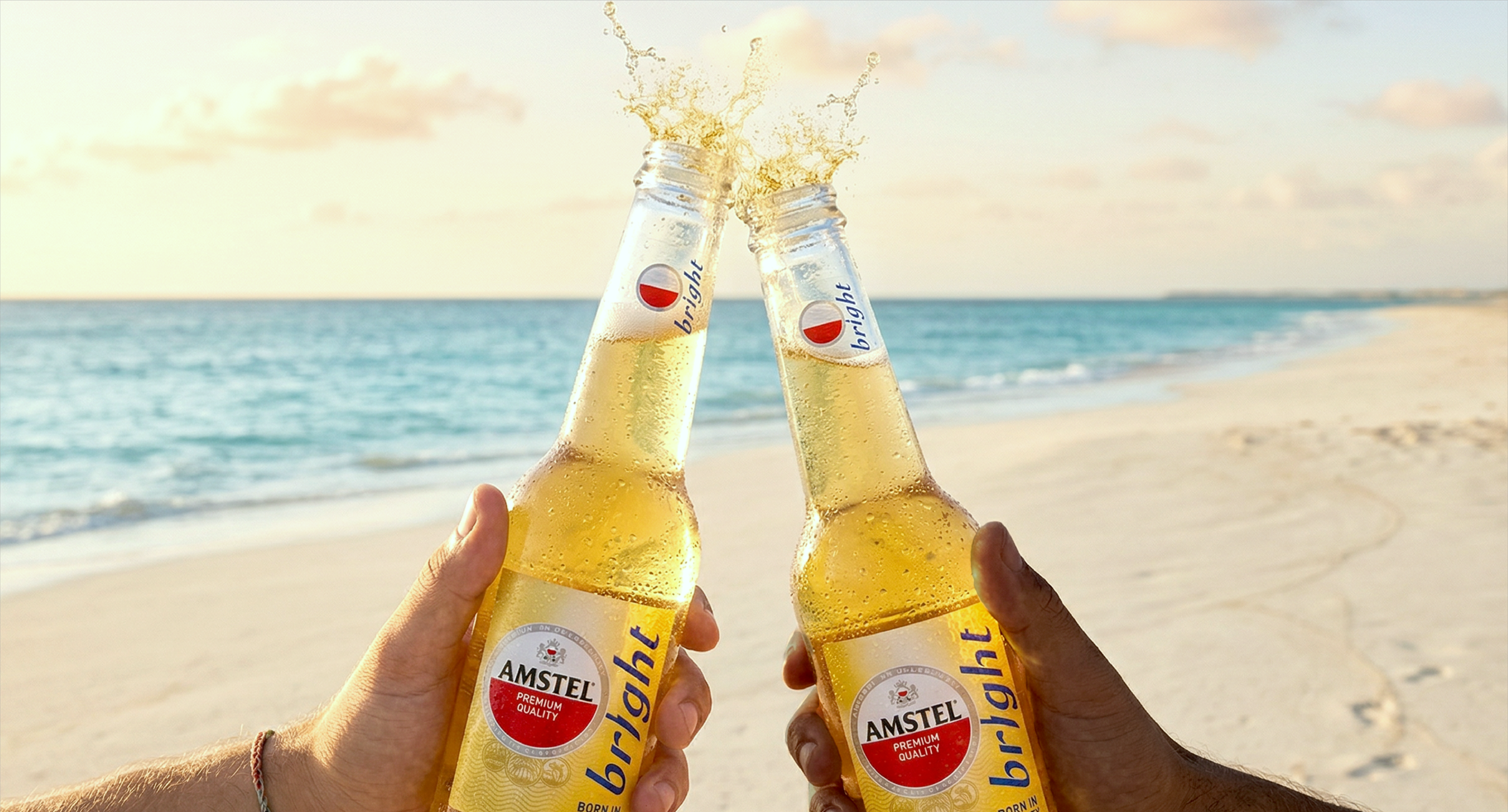
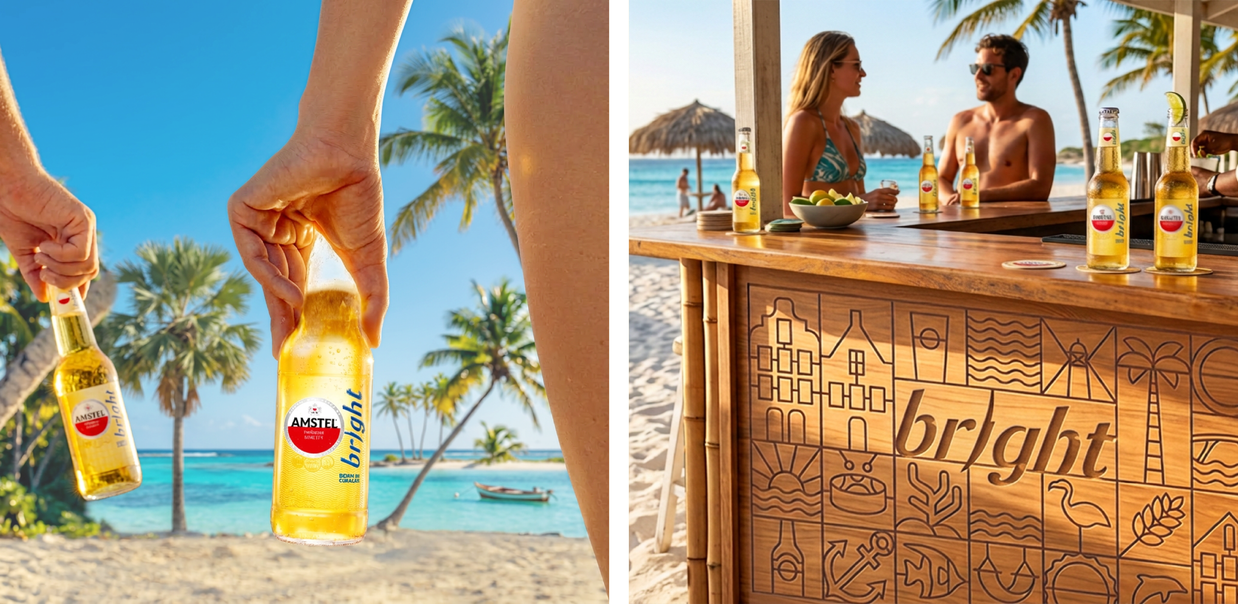
We took the new global Amstel identity and gave it a Caribbean twist. Staying true to the renewed global brand codes, we translated them into a fresher, sunnier and more expressive world made for Amstel Bright.
At its heart is a newly crafted Bright wordmark — bold, fluid and full of energy — combined with the iconic Amstel roundel, vibrant Caribbean yellow and Bright blue. Together, they create a distinctive identity that clearly belongs to the global Amstel family, while feeling unmistakably at home in Curaçao.
One global identity. A whole new kind of Bright.
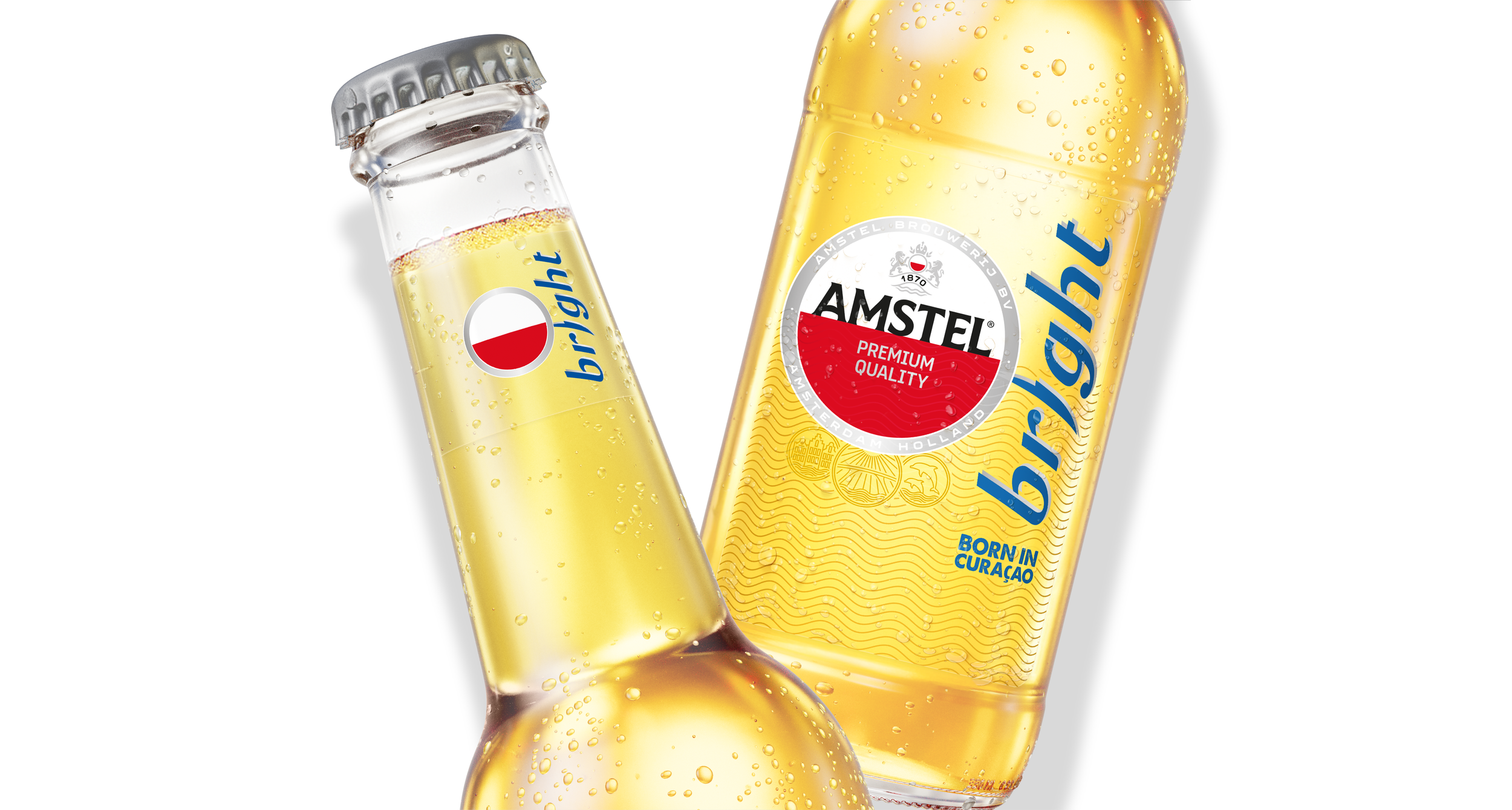
To give the global identity a genuine sense of place, we created a series of bespoke Curaçao icons inspired by the island’s architecture, landscape, coastline and everyday culture. Together they create a rich graphic layer that brings local character into the Amstel world.
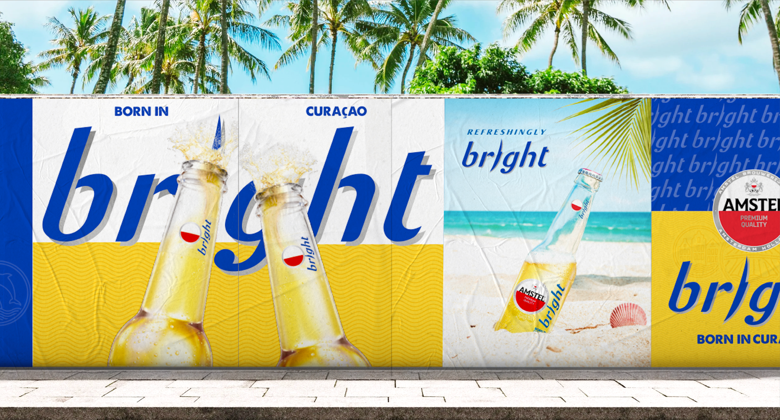
We redrew the Bright wordmark to give the brand a stronger and more distinctive voice. Fluid, energetic and slightly playful, it brings a fresh Caribbean attitude to the more structured Global Amstel identity.
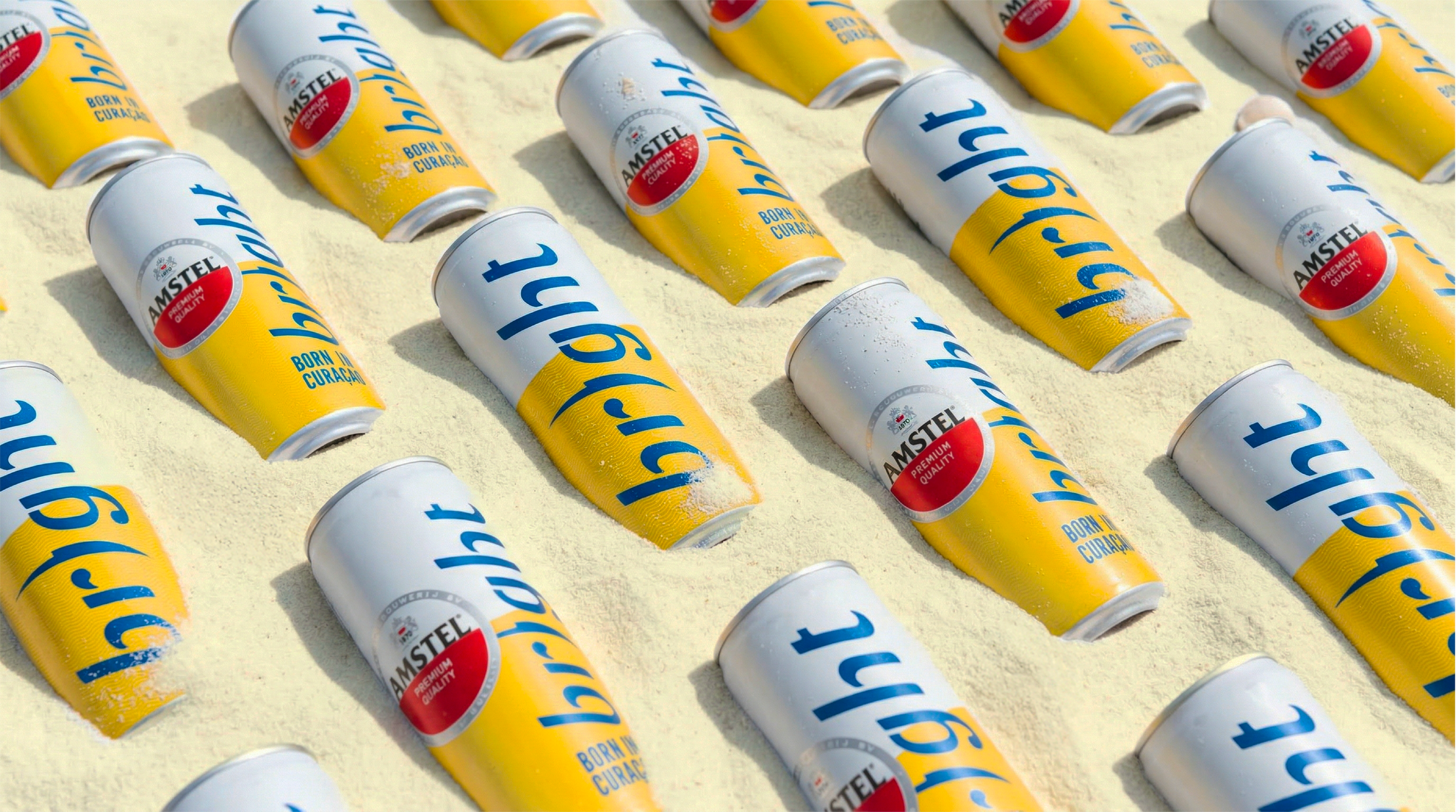
The global Amstel codes remain the foundation, but the palette turns up the Caribbean. Sunshine yellow and vivid Bright blue bring freshness, visibility and energy — creating instant recognition across packaging and communication.
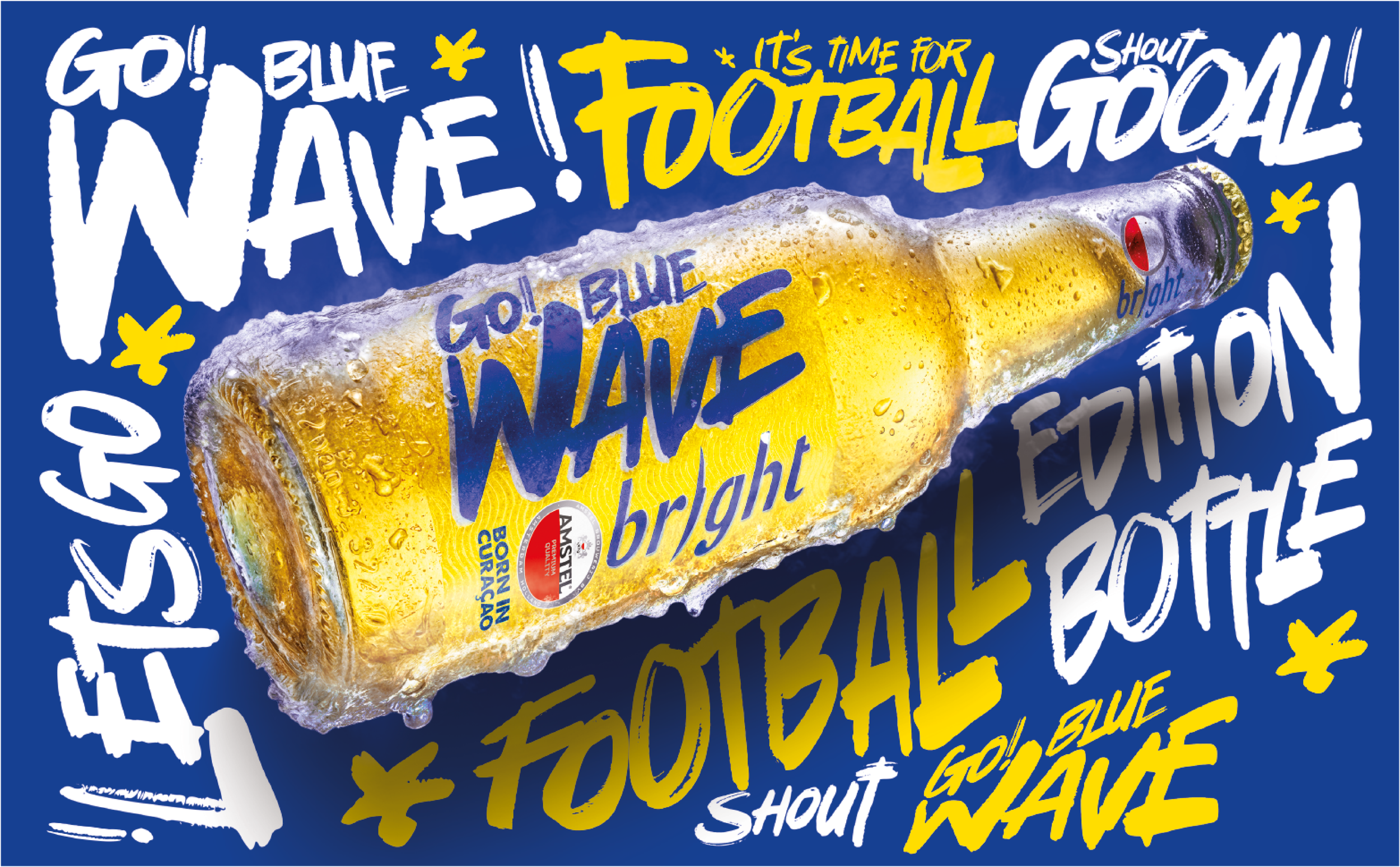
WORLD CUP ADD-ONS MADE BY LOCAL AGENCY