NEW LOOK: CREAMY & TASTY WITH AN L.A. PUNCH!
Client: Wessanen / Brand: Abbot Kinney’s / Category: Beverages / Market: Europe / Fields: Branding, Packaging Design, Illustration
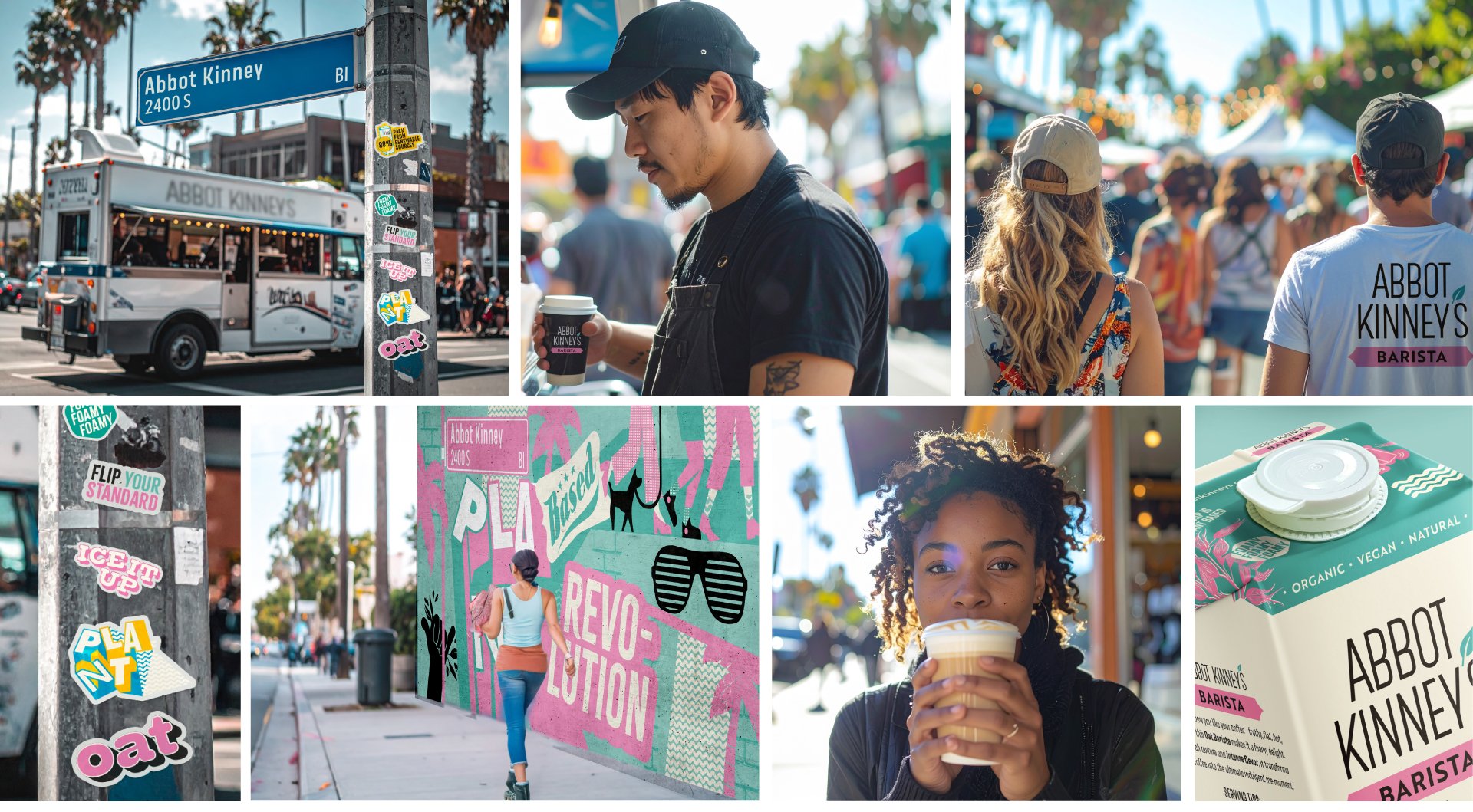
We’re excited to introduce the new visual identity for A.K., where we’ve blended purity and taste with a fresh burst of expression and fun. While A.K.'s core values remain at the heart of the brand, our goal was to bring a more vibrant and lively side to their visual presence, capturing the essence of the brand in a new, dynamic way.
I’ll have one to go!
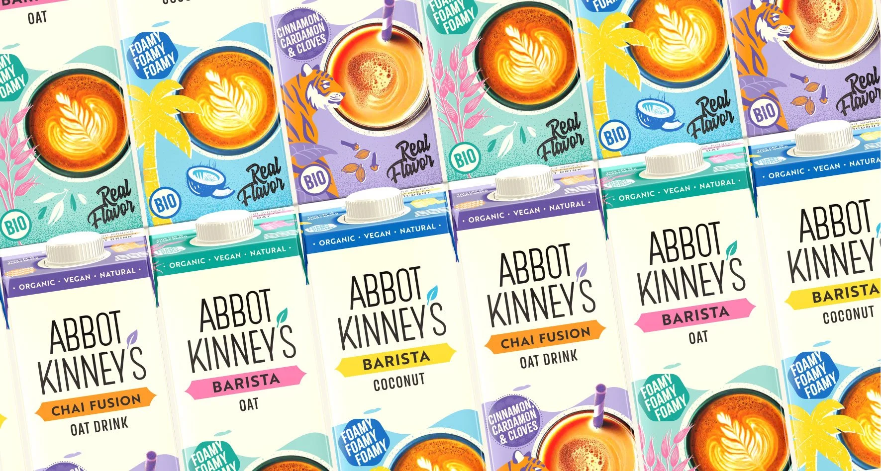
Inspired by the vibrant energy and creamy sunsets of Los Angeles, A.K. redesigned its color palette to reflect both purity and playfulness. The soft, creamy white of the plant-based milk is our new background color of the packs, symbolizing smoothness and wholesomeness. Bold hues like warm yellows, blush pinks and L.A. style greens & blues were added, capturing the dynamic spirit of the city. These colors balance A.K.'s clean essence with a lively, expressive twist, much like the city itself—modern, inviting, and full of energy.
NEWLY STYLED ASSETS & BRAND WORLD:
Our typography choices are a balance of clean and expressive styles. On one hand, we use the sleek and refined Merlod font, which mirrors our logotype and pairs with the Brother font for flavor names, representing the pure and clean side of the brand.
On the other hand, we introduced bolder, more playful fonts to bring a rougher, fun edge to the brand. These fonts, with their curly, chunky or coffee-inspired textures, work together like illustrations, complementing the photography and illustrations of our new character. They add an expressive, lively touch while still fitting with our overall brand identity.
The photography and imagery follow a similar approach, alternating between pure, clean visuals and more expressive, gritty illustrations. This blend captures both the refined and playful aspects of the brand, creating a dynamic balance that is both fresh and lively.