N’TAY ASCENDS WITH NEW WINGS!
Client: Heineken CONGO / Brand: N’TAY/ Category: Alcoholic Beverages
Market: CONGO, Africa / Fields: Branding, Packaging, Visual Identity
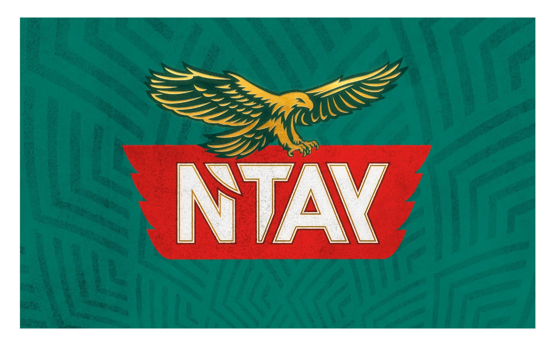
With the restyling of N’TAY, we aimed to give the brand a bolder, more iconic presence.
In the new design, the eagle has been completely redrawn—sleeker, more streamlined, and with an elegant graphic quality that conveys strength and confidence without unnecessary detail. Its wingspan now integrates seamlessly with the typography, creating a unified, dynamic mark.
The wordmark itself has been modernized: the bulky shadowed letters were replaced by crisp, geometric letterforms outlined in gold, giving the name clarity, strength, and a premium edge. The apostrophe is integrated in the letter ’N’ simplifying the logo and improving legibility.
The red base has been reimagined as a sharp, wing-like form, directly echoing the eagle above and reinforcing movement and energy. Together with a richer, flatter color palette, this creates a design that feels timeless, adaptable, and unmistakably bold on pack.
The new N’TAY identity is cleaner, more confident, and built to stand out in today’s competitive beer market.culture for generations to come.


